Distinctive walls for interiors: ideas for painting homes with on-trend colours in 2020
Pablo Picasso once said “colours, like features, follow the changes of the emotions”.
If we think about it, this also applies to our homes. How many times have you said: “I would really like freshen up the walls and splash in some colour”? Or perhaps you are casting around for new house-painting ideas?
Well, here are some tips on how to choose distinctive wall paints in keeping with 2020 colour trends.
Distinctive interior paints: the beauty of blue
Pantone, the American corporation responsible for having developed one of the best known and important colour-classification systems in the world, has elected “Classic Blue” as colour of the year for 2020. So, blue will be influencing product development in sectors such as fashion and design, but also the painting of interiors.
A “timeless blue, elegant in its simplicity”; a “reassuring” hue suggestive of the sky at dusk and which “offers the promise of protection and highlights our desire for a dependable and stable foundation on which to rest and build”. This is how Pantone describes Classic Blue.
It cannot be a coincidence that, psychologically speaking, blue represents balance in terms of colours; but it also symbolises nature (just think of the sky and the sea which are quintessentially natural). And as far as fashion is concerned, this shade embodies elegance and sobriety (a man's blue suit, for instance, conveys a sense of uncompromising formalism).
And now blue is back in a big way for decorative paints as well, both in darker hues and a desaturated version which verges on a baby blue.
Wall paint: ideas to be matched to blue
As a shade, blue can be used in many different ways in the interior-paints sector:
• various nuances of blue can be combined to create an optical resonance between the gradations;
• blue can be counterpointed by yellow (another colour trend for 2020);
• paler tints of blue can be put next to each other, juxtaposing them with dark reds, brick oranges, copper or an orange-brown hue typical of rusted iron. This combination will give a surprisingly appealing wall paint with remarkable visual impact.
Modern techniques for wall paint: VALPAINT's recommendations for exalting blue
In its quest to create solutions for interior wall paints with a good range of matchable shades, VALPAINT, a leader in the production of decorative paints, proposes the use of blue (with particular reference to our product VALSETIN 500 Col. 428A) counterpointed by a brownish-red hue to be obtained via our product KLONDIKE CORTEN (Ref. 102).
But keep on reading. In this version, the corten-effect paint called KLONDIKE CORTEN does not only deliver colour, it also has a texture and consistency which makes this product a pleasure to feel and not only to see (Do you want to know more?) Read about all the features offered by KLONDIKE CORTEN in the post “Corten-effect paint: the elegance of a rusty glow”).
Distinctive wall paint: the use of dark red/copper
Another shade of great interest for the sector of distinctive paints in 2020 is dark red/copper.
This shade is the next step on from terracotta red which became popular and widely used from 2017 onwards until it turned into a copper-like hue (a clear historical reference to the ‘70s).
An earthy colour, dark red evidences once more our indissoluble bond with nature. In 2020, this colour is making a comeback in all sectors, including that of interior design and wall paint.
Combinations for achieving strikingly beautiful walls with red
Other appealing combinations for this colour (in addition to that of light blue and copper already described above) are those with hues that are almost complementary because they contribute to a delicate visual balance:
• combined with dark pink, creating a contrast which is almost impalpable
• mishmashed with mustard yellow, green and brown, channelling a mood which evokes the stylishness of the Seventies.
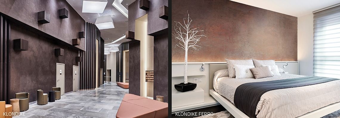
The decorative paints from VALPAINT which will give the best rendition of these combinations are:
• VALRENNA Col. 471A
• KLONDIKE FERRO with a Copper Oxide Effect
• KLONDIKE Col. 426A + G100
For the colours to be matched we have:
1) For mustard/ochre yellow:
• VALRENNA Col. 539A
• VALSETIN 2 Oro 709 + Col. 434C
• POLISTOF Col. 313
2) For the greens:
• VALRENNA Col. 442A
• VALSETIN 2 Silv. 700 + Col. 446C
• SABULADOR SOFT
• METEORE 10 INTONACO Col. 534A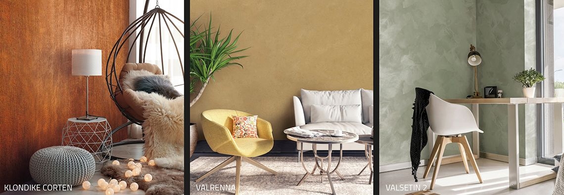
Transcending the concept of colour for walls, VALPAINT has upgraded some of its products with another interesting feature - texture.
Indeed, for the year 2020, the feel of a surface does not take second place to its appearance and the interior-design sector expresses this trend by the return of velvet.
Momentarily put to one side, this lush fabric is back in VALPAINT’s modern paints with its VALRENNA velvet-effect paint When touched, it delights with a sensuous softness that brings to mind velvet (if you want more details about this paint, please also read “Modern interior paints: how to paint the walls of your home using new colours”).
Yellow for a special-effects wall paint
Yellow is another shade that will grab our attention in 2020 for interior wall paints.
It varies from a pastel/lemon yellow to an ochre/mustard hue. Generally speaking:
• in its darker variant (ochre), it looks good with dark red (as described above) and successfully achieves a ‘70s-style decorative effect;
• it looks great with dark blue as well because it plays on colour temperature in the sense that the cool shade is tempered and enhanced by the warm one;
• a pale yellow pairs perfectly with pastel hues.
The VALPAINT yellows that best render these effects are to be found in the previously mentioned products (VALRENNA Col. 539A - VALSETIN 2 Oro 709 + Col. 434C - POLISTOF Col. 313).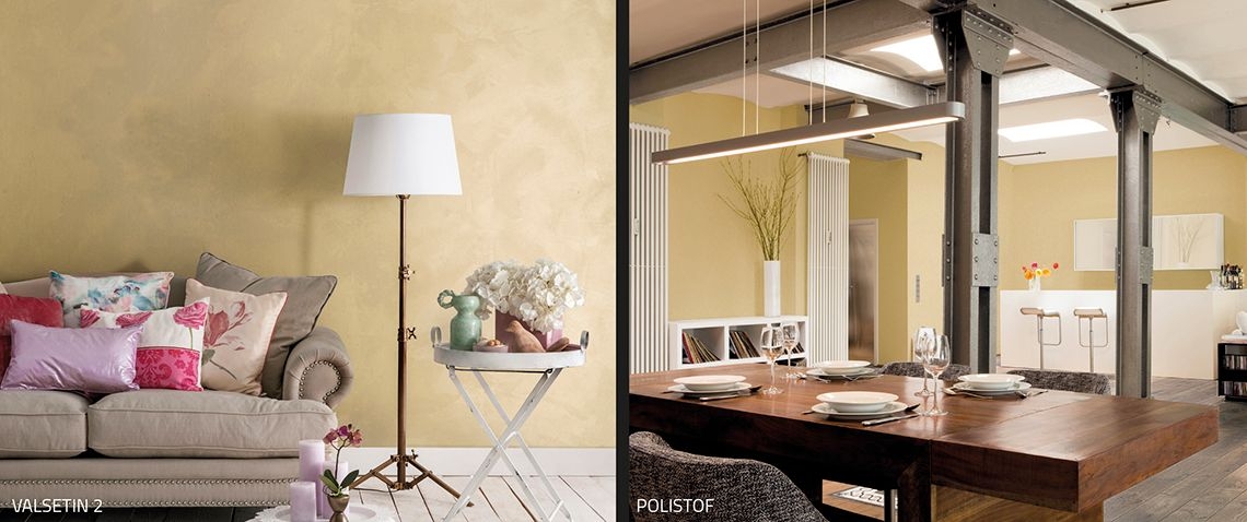
Distinctive wall paints: the grace of green
Another major contender for wall colours in 2020 is green. It is to be found in bright rich hues which fade away into paler versions until they almost turn into a sage green.
Chic combinations can be achieved by using various gradations of green of the same intensity; otherwise the green can be counterpointed by yellows, browns and dark red/coppers, recreating the eclectic atmosphere of the ‘70s.
If you want to try green, VALPAINT has the following decorative paints that will suit your purpose:
• VALRENNA velvet-effect paint Col. 442A
• VALSETIN silk-effect paint 2 Silv. 700 + Col. 446C
• SABULADOR SOFT Silv. 100 + Col. 535A
• METEORE 10 INTONACO Col. 534A
These are only some of the colours/materials available, but VALPAINT has a wide array of decorative paints and coverings to help you find the shades you require to meet your trendy-colour needs and fancies.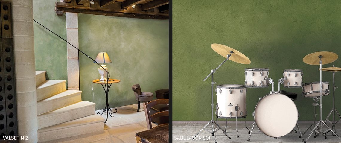
Distinctive interior paints: decorative effects with neutral hues
Often people think that changing the look of our home means painting it in “bright” colours.
But, in actual fact, neutral colours can be a much better solution and we can solve our dilemma with a sandy yellow, champagne hue or something in between. By definition, pure white is a non-colour and not without its uses, but it is usually better to go for one of the neutrals mentioned above.
When we work with neutrals, matching effects and contrasting looks can be achieved with any colour from the spectrum, but attention must be paid to all those variable factors that can affect the overall aesthetic of a room.
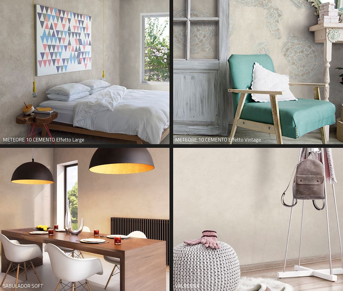
VALRENNA, VALSETIN, METEORE 10 CEMENTO, SABULADOR, SABULADOR SOFT and many others of VALPAINT's decorative products have colour ranges that will completely satisfy your desire for a neutral look.
Whatever hue you opt for, colour is a crucial decision if you want to accomplish a distinctive-looking interior wall. When we decide on our palette, we are not just choosing a colour or texture, we are often creating the core identity of our project.