I like details.
The dusting of icing sugar on a cake, the sprig of basil on a pasta dish, the button on a cuff...
They aren't essential, but they make all the difference.
• Fabrizio Caramagna •
Why have we decided to begin with this quote? Because we believe that also in the wall paints sector, it is the small details that really make all the difference.
Fundamentally, decorative paints can be likened to an outfit: the purpose is never simply to cover us up. In fact, the most important function is to say something about the wearer, who they are, and how they view and interact with the world around them. And this is done through details: the different shades of colour that we choose, the fabric and the cut of a garment.
Just like the clothing we choose to wear, modern paints represent the synthesis of certain elements that dictate how they are perceived aesthetically.
There are three fundamental qualities that define a decorative product:
• colour, offering a chromatic identity through the use of different shades
• texture, accentuating the aesthetics, and
• feel, emphasising the physical qualities of the product.
All of these features represent essential tools for designing interiors, where walls become features in their own right, carefully considered and decorated to say something about us.
Distinctive modern paints: a splash of colour is enough to reinvigorate the walls in your home
Think back... In our previous post “Distinctive walls for interiors: ideas for painting homes with on-trend colours in 2020” we presented the new colour trends for 2020.
The most popular shades in the context of interior design (and beyond) were unquestionably blue, dark red/copper, mustard yellows, lighter tones of green and neutral colours replacing the classic white.
Here, we would like to reflect on a different aspect of these trends. The chromatic qualities of a decorative paint are not always clearly defined. In fact, depending on the design and texture of the product, there will be variations in colour. The result is distinctive wall finishes that allow creation of astonishing optical and tactile effects.
Let's have a closer look at these special interior paints.
How to use blue for unique interior finishes
First of all, we must remember that blue is the Colour of 2020. And yes, that’s Colour with a capital “C”, the absolute king of this year's palette.
Depending on the decorative effect employed, blue can accentuate or reduce the perception of chromatic intensity. Some examples? Let’s take a look at some options from the VALPAINT catalogue, as a leader in the production of decorative paints.
Blue in the distinctive sand-effect SABULADOR, SABULADOR SOFT and MAVERICKS
In SABULADOR, SABULADOR SOFT and MAVERICKS, Valpaint's sand-effect finishes, blue undergoes a range of variations in tone.
This is a product of the actual nature of these distinctive wall paints that include grains of sand of varying sizes. These grains are highly sensitive to natural and artificial light, which catch reflections and, in some cases, emphasise the pearlescent effect.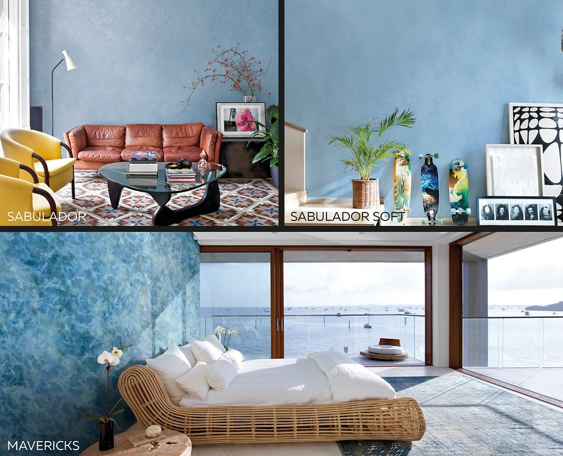
Tactile effects using blue for feature walls: VALSETIN and VALSETIN 2
Used in shades of blue, finishes such as VALSETIN and VALSETIN 2, whilst more uniform compared to a sand-effect paint, give a “fuller” colour tone, not only emphasising the colour, but also the subtle pattern and tactile quality of the product.
VALSETIN, in both versions available, is the perfect choice to emphasise the fabric effect of a decorative paint (silk in this case), for elegant and refined interiors.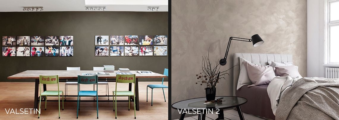
Distinctive colours for interiors: the “metallic” blue of KLONDIKE
Sticking to blues, we can also achieve tones with a more metallic aspect and flashes of colour. One example is KLONDIKE, a decorative paint with vivid metallic reflections.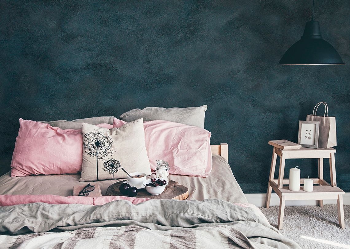
Distinctive paints for modern interiors: bold red
Dark red tones, with a brownish intensity, work particularly well with metallic finishes for walls that offer rusted-iron and corten effects.
An interesting solution here is KLONDIKE CORTEN from VALPAINT, a corten-effect paint that in addition to an aesthetic and chromatic effect, is also rough to the touch, just like genuine rusted iron.
The composition of this extraordinary product allows:
• use on outdoor surfaces (e.g. building exteriors, for a highly contemporary aesthetic)
• use on vertical surfaces to generate the “lotus effect”, where droplets of water simply run off the surface rather than building up.
In addition to KLONIDKE CORTEN, other materials that work wonderfully in copper red include KLONDIKE and KLONDIKE FERRO. In the various different versions, these give surfaces highly contemporary decorative effects with a strong aesthetic impact.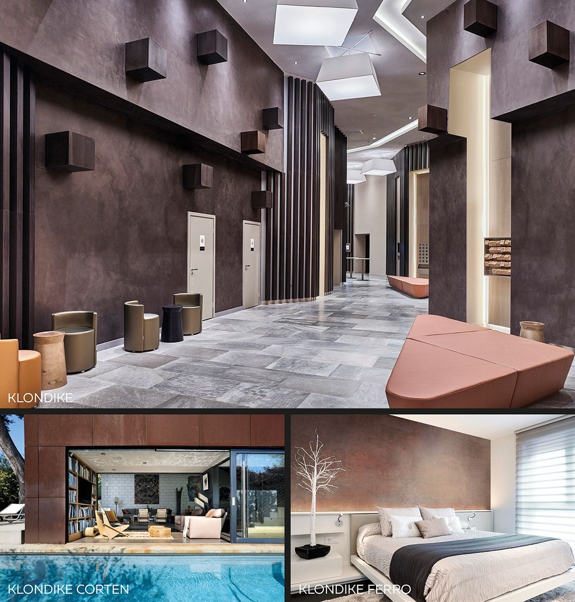
Distinctive paints for home interiors: a touch of yellow puts a new light on things!
Yes, yellow is also amongst the on-trend colours for 2020. Popular tones lean towards greater saturation, right through to colours such as ochre yellow and mustard.
VALPAINT's offering in these shades is represented by two decorative effects that celebrate this choice, each with their own specific properties:
1) POLISTOF is a unique fabric-effect wall paint, which can be applied as standard or with the addition of L50 microcrystals. With a seemingly uniform aesthetic, in reality this special interior paint is a festival of yellow ochre tones. When it catches the light, it offers truly distinctive chromatic effects.
2) VALPAINT’s ROCOCÒ, commonly referred to as Venetian plaster, is emblematic of these colours. In fact, its greatest strength is the ability to highlight not just one tone but several gradations within the same shade, the defining characteristic of the plaster effect.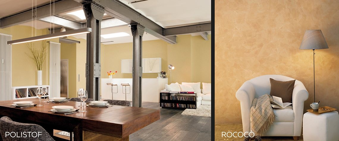
Distinctive walls in the home? Discover the potential of sage green!
Another top colour for 2020 is sage green. Starting from a more intense green tone, this is then desaturated to reach the on-trend look. Not only does it bring to mind the herb with its colour, but also with its finish, like the velvety surface of the plant’s leaves.
This double representation, both tactile and chromatic, can be seen in VALPAINT's VALRENNA modern wall paint that stands out for its refined elegance. VALRENNA has a soft feel, almost creating the sensation of suede leather. And the rest? This is handled by the other shades that VALPAINT has selected.
Neutral colours: distinctive paints for the sitting room, kitchen and bedroom that are always fresh
In the 2020 interior design palette, white has been partially replaced with colours towards sand and through to champagne tones.
These neutral colours are included on all VALPAINT charts, independent of the individual nature of the products.
What really makes a difference? It’s all in the detail, as we said at the start! The special qualities of different shades are generated by the product finishes, whether smoother or bolder and more tactile.
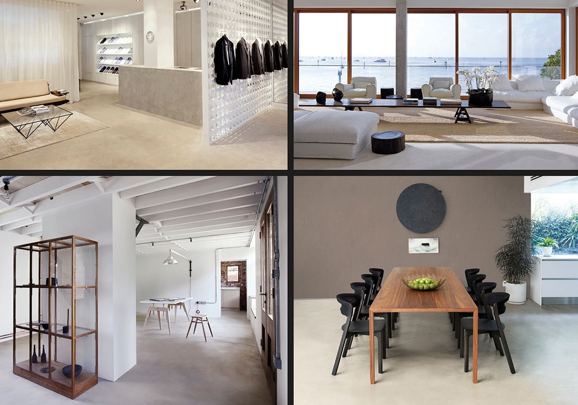
For neutral colours and uniform surfaces, VALPAINT offers a newly developed and unique product: VALPAINT I-BETON.
This decorative system for continuous surfaces:
• can also be used for surfaces in wet environments, including where it is in direct contact with water
• can be applied directly on existing tiles without removing the coating already in place, with obvious economic benefits
• in addition to being an extremely hi-performance technical product, satisfies even the most sophisticated aesthetic requirements, for continuous surfaces with a contemporary mood.