
- Company
- Designs and finished projects
- Contacts
- Blog
- Products
- Video
- SELLING SERVICES
- VI&D
- sustainability


The Hateful Eight di Quentin Tarantino.
Blade Runner 2049 di Denis Villeneuve.
Qualcuno volò sul nido del cuculo di Miloš Forman.
E ancora Arancia Meccanica di Stanely Kubric.
We tend to emphasise the importance of colours, their combinations and the interplay between light and colour. But have you ever considered the value of “non-colour”?
In each of the above films white appears to describe something. It denotes segregation in Forman’s film, while in The Hateful Eight and in Blade Runner it’s associated with isolation, silence, peace and muffled senses. In A Clockwork Orange its meaning is distorted, as Stanley Kubrick uses it “negatively”: anything white evokes violence.
These examples taken from cinema reveal how white, the quintessential non-colour, despite being referred to as an impersonal colour, is in fact capable of adding considerable personality to any project.
This is true for cinema but even more so for interior design projects, in which white is used to convey an impression of order and cleanliness and to bestow a sober yet sophisticated look on the graphic project. White is indeed very bright but lacks tint and is opposed to black, which instead reflects the total absence of colour. Rather than colours, both can be defined as shades in relation to light: black as the absence thereof and white as its pure essence.
Let’s discover its full potential with VALPAINT decorative paints!
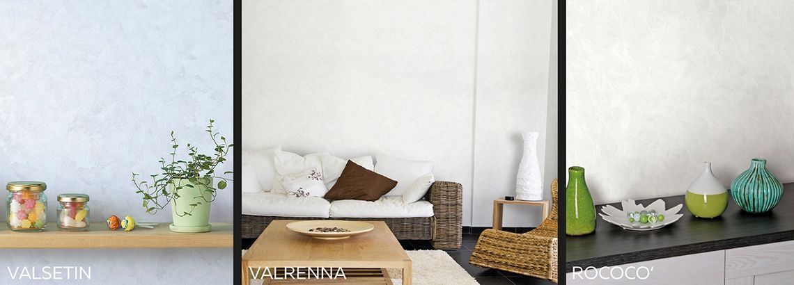
White in the VALPAINT collection of wall paints with special effects
VALPAINT, a true leader in the design and production of decorative paints for years, besides studying materials in terms of their chemical composition (with a careful eye to the environment), focuses its research activities also on the various nuances of its products.
These studies also include tests conducted on the textures and material aspect of the products. These two elements are able to enhance white which, thanks to shading, takes on new and unexpected tones.
White features in all VALPAINT decorative paints, both as an actual colour and as the starting base for some of the decorative paints appearing in the various collections.

White in the sand-effect SABULADOR paint
In the various decorative products, white varies in relation to the material aspect and texture of the products used.
The SABULADOR, a decorative paint characterised by its coarse-grain sand-effect finish (available in the LUX and MATT versions), white appears differently also within the same colour code.
The white reference for SABULADOR LUX is Col. 614: white is even more pearlescent, while in the MATT version it appears cooler and almost dusty.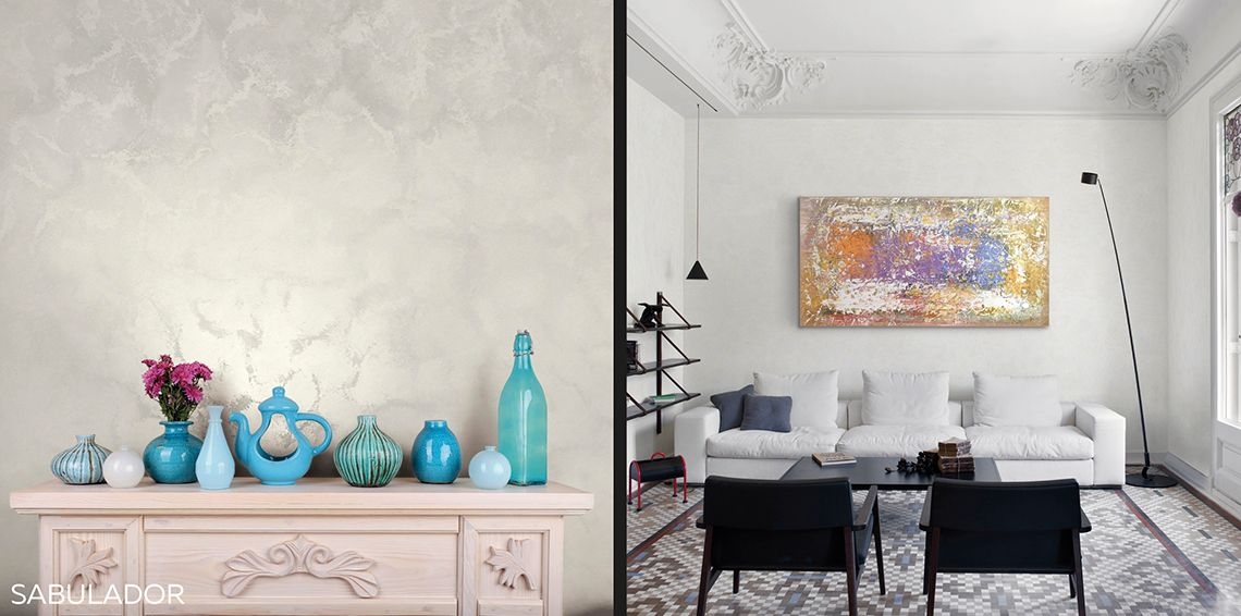
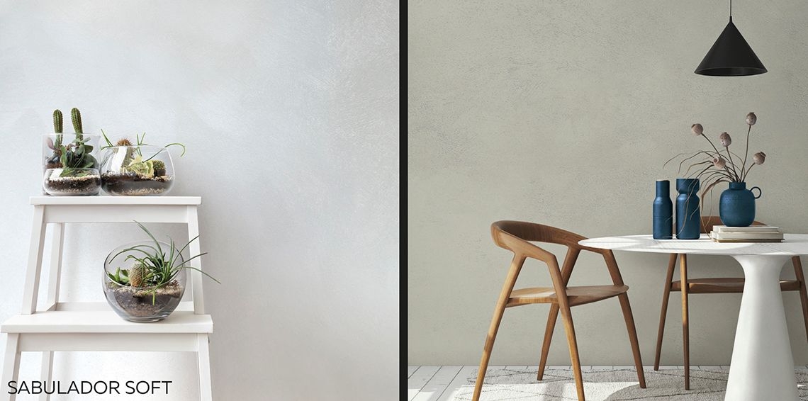
Also for SABULADOR SOFT, a decorative paint with sand effect and a finer grain compared to the previous product, the whites with LUX finish (identified by the ARGENTO 100 and BIANCO PIENO 400 colour codes) are glossier and brighter compared to the SABULADOR SOFT MATT version which, through the GESSO 500 colour code, appears more toned down and cooler. The grain that enhances the decorative finish almost appears to penetrate the product and then disappear, leaving the purity of white to emerge in all its beauty.
METEORE 10 CEMENTO and MARMORIZZATO: how to enhance white with decidedly modern paints
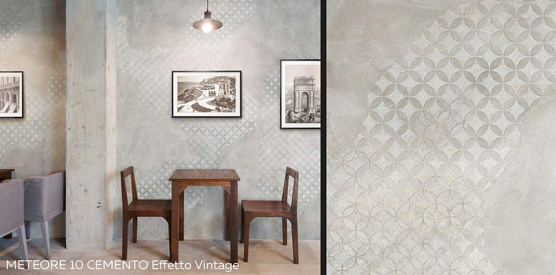
Another decorative wall paint for interiors in which the evident three-dimensional aspect enhances the various shades of white is METEORE 10, offered in the CEMENTO and MARMORIZZATO versions.
Thanks to the textured quality of METEORE 10 CEMENTO, white appears in countless shades. The designs that VALPAINT proposes for this decorative paint ensure that there are never two identical whites. Each one is created and re-created from scratch thanks to the light-and-shade effects and the craftsmanship quality defining them.
The various textures that aptly reflect this concept are coded as follows:
• METEORE 10 CEMENTO White Effetto Compatto
• METEORE 10 CEMENTO White Effetto Large
• METEORE 10 CEMENTO White Effetto Slim
• METEORE 10 CEMENTO White Effetto Levigato
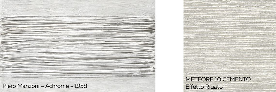
• METEORE 10 CEMENTO White Effetto Rigato which distinctively sums up the concept developed by Piero Manzoni with his work Achrome, which we analyse further below.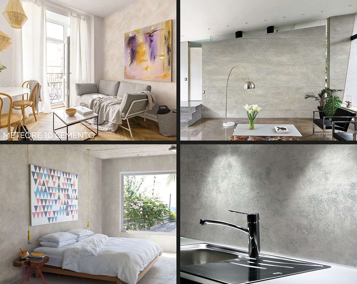
METEORE 10 can also be used in the METEORE 10 CEMENTO Effetto Vintage version, where the white of the background allows the floral and geometric decorations to emerge which, in turn, bring out different shades of white thanks to the three-dimensional effect. In its more abstract dimension, this decorative effect recalls the first studies by Kazimir Malevich focusing on white on white.
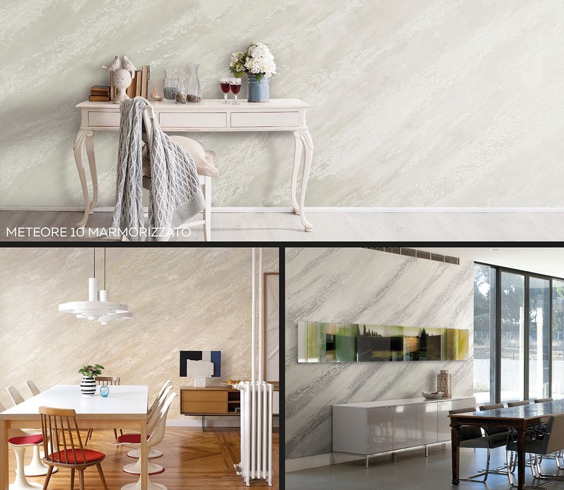
Lastly, in the METEORE 10 collection white basically turns into marble with METEORE 10 MARMORIZZATO, in which the veining creates a light-and-shade effect that alters the resulting effect despite the same type of white used in this product.
(For more information: Cement-effect paint in an urban-industrial style)
The exquisite brightness of white in the POLISTOF decorative paint for walls
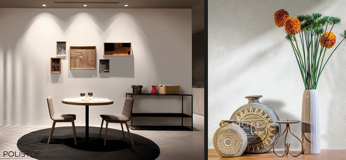
Another particularly modern paint by VALPAINT in which white takes on different tones and plays off its own brightness is POLISTOF, a polychrome product with fabric effect.
Besides the special tactile quality of this decorative paint, it is its aesthetic appearance that comes to the fore. Besides the base version, the product is also available in the version with special micro-crystals that further enhance its brightness – an essential characteristic of white.
Due to the fact that this decorative paint is highly sensitive to light, the white in POLISTOF, for colour codes Col. 309 – 348 – 388 and Col. 309 – 348 – 388 + L50, is naturally able to enhance the countless shades of white.
(For more information: Fabric-Effect wall paint: all the features of POLISTOF)
Discover the “silk-white” of the VALSETIN 2 modern decorative paint
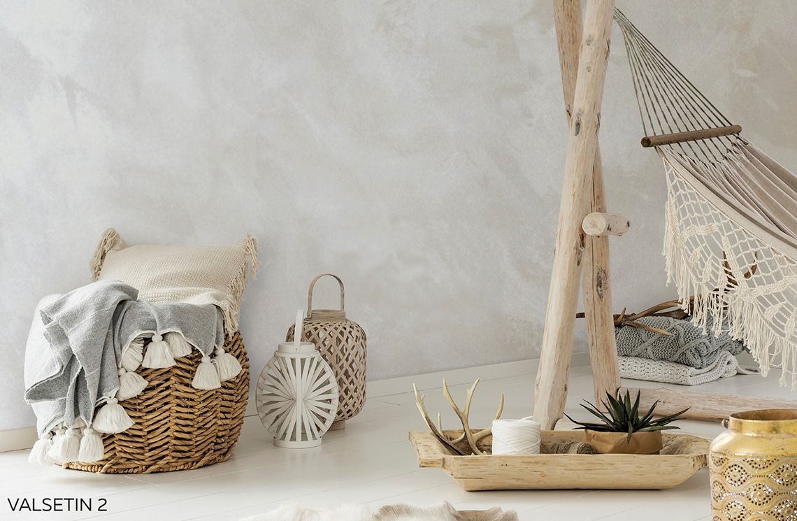
VALSETIN 2 is a decorative paint that emphasises the product’s tactile effect and leaves the decorated surfaces looking like actual silk, with its distinctively inviting shades. Also for this product, using the colour code ARGENTO 700 makes the white appear virtually imperceptible as the soft and delicate texture is enhanced, becoming almost one with the product’s material.
Go wild with the VALPAINT JUNGLE collection and the crocodile-effect white in the new painting techniques for interiors
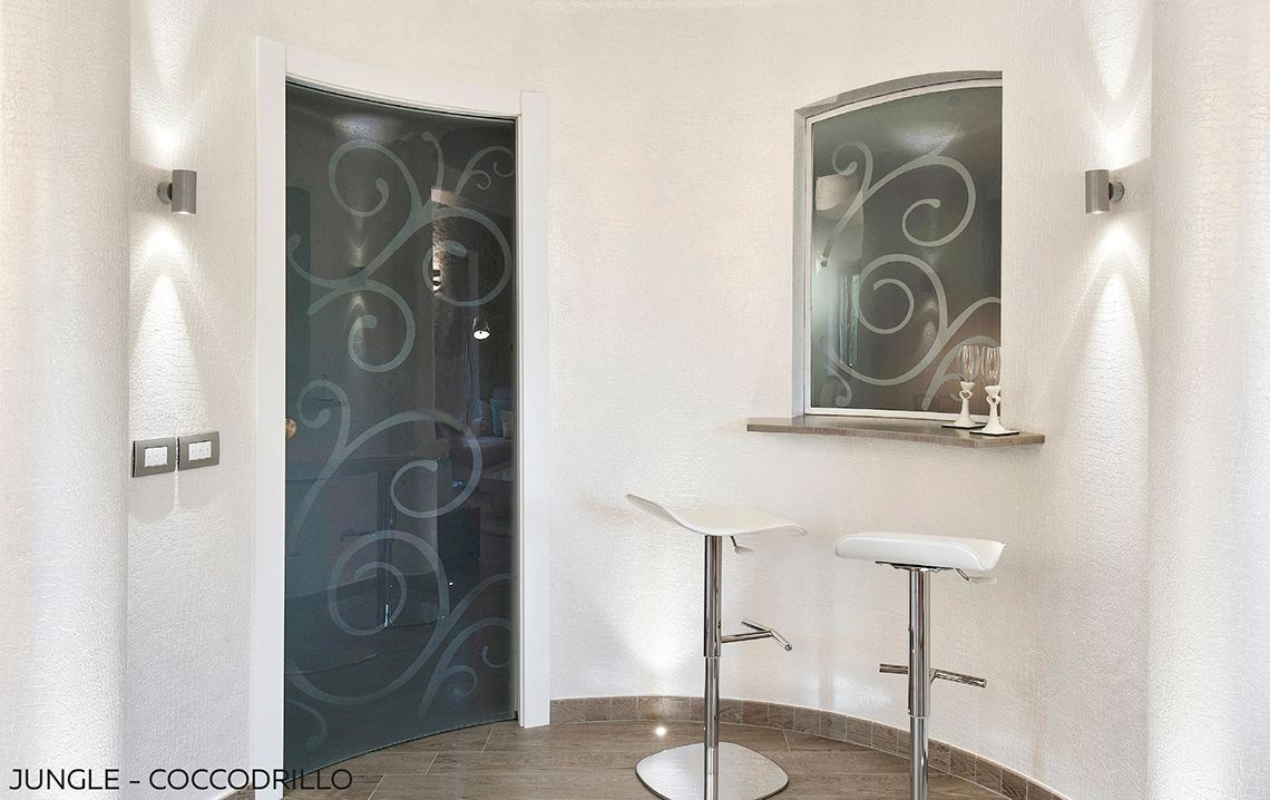
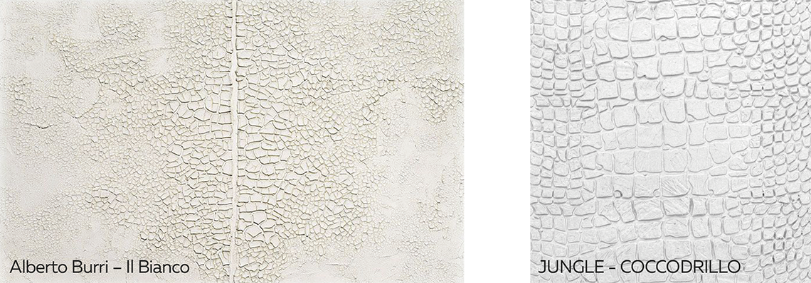
Drawing inspiration from the works of Alberto Burri, VALPAINT proposes white with a CROCODILE effect in its most exuberant collection, JUNGLE. The product’s three-dimensional quality enhances the shades of white thanks to the bas-relief effect emphasised by the texture.
A journey through white in art
White: a non-colour, but also the sum of all possible colours. White for brightening up and lightening, white for writing on a black background.
A challenging idea introduced by the art world revolves around superimposed whites. The question is: “What about white on white?”. Does it make sense to create something of the same colour as everything else around it? And also: “How can a shape or profile or figure emerge from a background of the same colour?”.
To answer these questions we turn to Wassily Kandinsky, who wrote: “White affects us with the absoluteness of a great silence”. So then, white resembles the absence of sound. It is like a place of purity, of nothingness or of the invisible.
White can speak of silence, concealment and gradual subtraction verging on nothingness. It all began from these concepts, through an exercise of extreme abstraction.
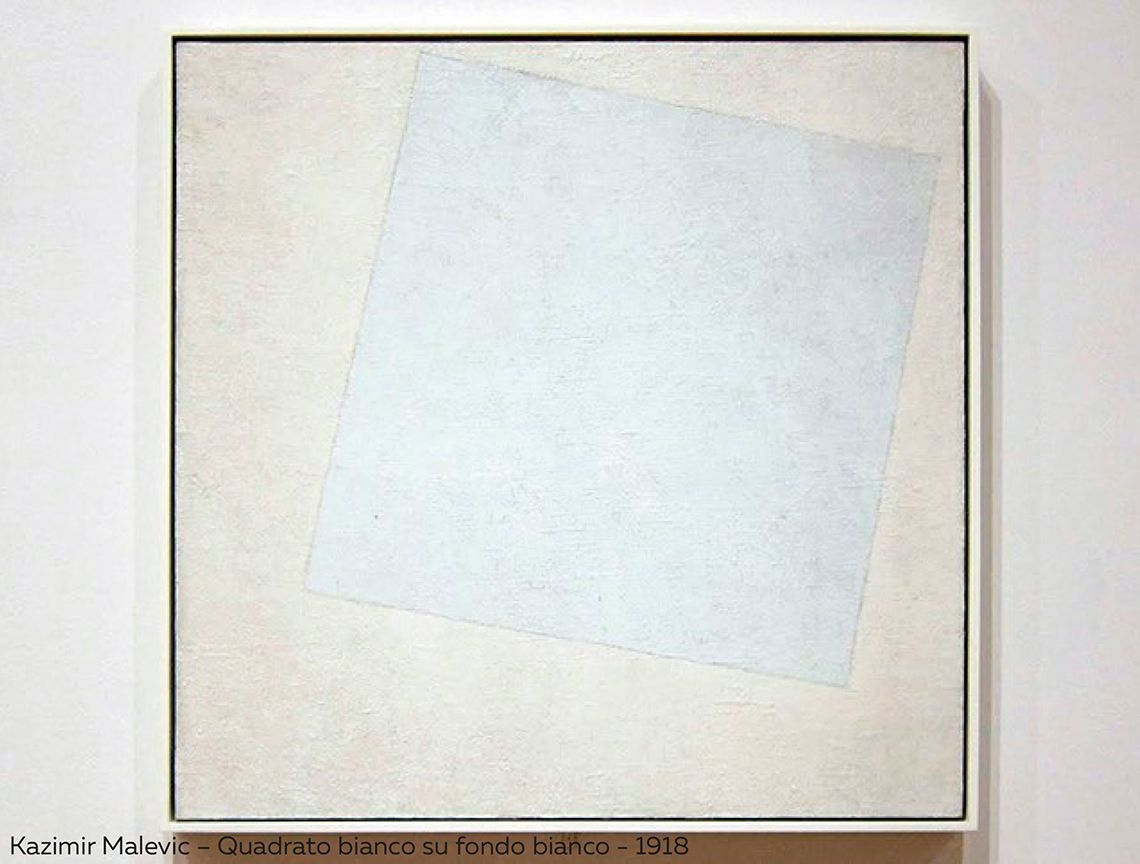
It was 1918 when Kazimir Malevich, the Russian painter who founded Suprematism, completed a painting that was unprecedented at the time. The work consisted in a white square on a white background. The only visible sign was a border defining the perimeter of a square-shaped form, slightly rotated. The idea Malevich seemed to convey was that of a delimited mental and abstract area, a non-object that was nonetheless possible. And the slight yet decisive difference between the two shades of white confirms the existence of that protected space. Almost invisible.
Because it’s easy to say white... We tend to associate with “white”, quite heedlessly, whatever appears to be the lightest point in our visual field. But two whites are seldom identical.
After Malevich and his abstractions, we had to wait almost thirty years to see white back to the fore again. Between the works of the Russian painter and those of the second post-war period are the works of Ben Nicholson, who used white for light geometrical shapes located on different levels to form a “contemporary” work.

Many painters from the 1950s onwards painted canvasses using a perfect and uniform white. Their works appear empty as if untouched. This conceptualises the fact that a painting is not static but evolves continuously and the observer can only imagine what happens on the white canvas.
A fitting example are the panels by Robert Rauschenberg.

Many artists cannot resist the charm of white on white. We can find works in this mould by the leading figures of Conceptual Art, Spatialism, Pop Art, Arte Povera and Minimalism.
Piero Manzoni filled his white surfaces with crackled fabrics and plaster in his Achrome works (produced between 1957 and 1963).
In the case of Alberto Burri, white breaks up and the shades produced by the cracks convey a distinct impression of arid terrain.
This apparent regularity evolves into surgical precision in the slits which Lucio Fontana cut through his canvasses. Many of them are white. But not the original white of the support: they were painted that way. So the surface, made rigid by the paint, reacts to the slit more vigorously.
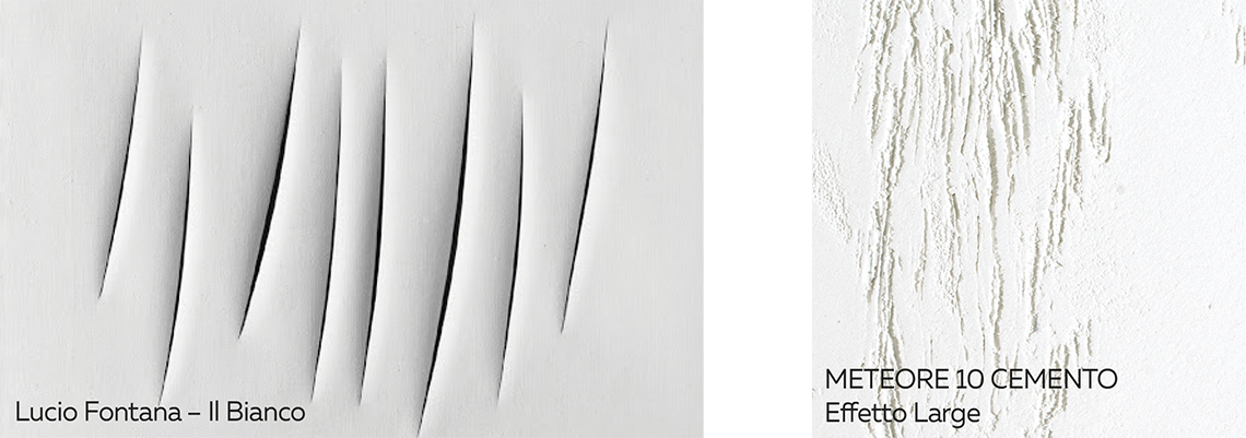
As we can see from this brief survey of white and the way it has been studied and used, there’s no doubt that it has always been regarded as a colour, albeit a non-chromatic one, but capable of arousing emotions not only psychologically but also aesthetically and visually.
White can be appreciated in its absolute dimension characterised by flat tones, but is more effective when enhanced by textures that, as evidenced in the works of art mentioned, succeed in creating figures, forms and material qualities that reveal its presence-absence.
Decorative paints are a worthy complement to white, whether it is used in textures and in the fainter shades but also in the more material and bolder-coloured paints.
White is a nothingness having the character of youth or, more exactly, the nothingness that exists before beginning, before birth. Perhaps the earth sounded thus in the white period of the ice age.
(“Concerning the Spiritual in Art” - Wassily Kandinsky)
2025 VALPAINT S.p.A. - Via dell'industria, 80 - 60020 Polverigi (AN) - ITALY - C.F./P.IVA/R.I. di AN 01108220425 - Privacy Policy - Cookie Policy