The VALPAINT water-dilutable enamel: spatial perception, nuances and sanitisation
How old is the very first colour ever used?
An astonishing 70,000 years!
That’s right, because colour was first used by the Neanderthal Man, whose rituals consisted in pouring a powder derived from grinding red ochre over the body of the deceased. It was the Homo sapiens who first used colour for artistic reasons: parietal art featured the use of black, red and yellow ochre, and white.

Since then, the study of colour has progressed becoming more sophisticated and innovative. Today we know for sure that light waves generated by colour are able to influence and exert varying effects on people’s moods.
It follows that also the harmonious composition of a space – whether for domestic, commercial or reception purposes – can be enhanced (or, conversely, damaged) by using a specific colour. This is why the predominance of a certain colour must stem from a conscious, thought-out and targeted decision.
Colour can indeed reveal the character of a room or object well before the eye perceives the shape of the space or of the object itself. Think about when you look at a painting, fresco or even a design object: the first sensation the eye (and, hence, the brain) perceives is not its shape but its colour.
VALPAINT water-dilutable wall enamels and chromatic-spatial design
The emotional reaction and the spatial perception that colour unleash make it an authentic chromatic-spatial design tool.
It is precisely with this intention that VALPAINT, an Italian company leader in the design and creation of decorative paints, studies its products.
A highly interesting example in this sense is the WATER-DILUTABLE DECORATIVE ENAMEL. VALPAINT proposes it in the following finishes: V55 MATT and V88 SATINÈ, two variants that can be used to create visually striking aesthetic solutions.
The V55 MATT or V88 SATINÈ WATER-DILUTABLE DECORATIVE ENAMEL can be coloured using the Valclone colour-mixing system and all colours of the NCS INDEX 1950 colour swatch can be obtained, making it possible to design and customise colour within the environments.
In addition to this interesting chromatic aspect, there are many other technical and performance characteristics that make the VALPAINT water-dilutable decorative enamel truly special:
• V55 MATT and V88 SATINÈ have both obtained the HACCP certification with reference to the UNI 11021 standard, the certification that allows the product to be used where foods are processed and packaged. This means, for example, that they can be used in kitchens in restaurants and at home;
• another key feature, tested in accordance with the ISO 22196 – JIS S 2801 standard, is their antibacterial properties, which prevent the proliferation of bacteria, fungi, algae and moulds over time. This is definitely a critical aspect for ensuring healthy and comfortable spaces;
• the VALPAINT WATER-DILUTABLE ENAMEL, in both the V55 MATT and V88 SATINÈ versions, can be disinfected using chlorine-active products (bleach), alkaline degreasers and acid descalers, in line with the UNI ISO 2812-1 standard. This feature ensures clean and sanitised spaces at all times;
• alongside its capacity to be disinfected, it also captures less dirt or, rather, it is very difficult for dirt, impurities and bacteria to adhere to the treated surfaces, making these easy to clean. This essential property is also governed by the UNI 10792 standard.

Warm and cool colours, and non-colours: how can we use them in interior design?
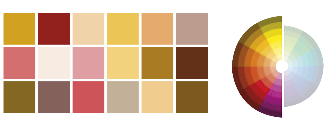
WARM COLOURS
|
Type of colour |
Meaning |
Tips for use |
|
RED |
Red is a highly stimulating colour that evokes passion, energy and dynamism. |
YES |
| ORANGE | Orange expresses motion, optimism and balance. Not only: according to the psychology of colour, orange is the colour of communication and hence social interaction. |
YES |
| YELLOW | Yellow is the quintessential colour associated with energy (in particular the sun’s energy), besides joy and friendship. |
YES |
| BROWN | In its various tones, brown is the colour of nature and psychologically conveys protection. |
A brown environment evokes comfort and security, which makes this colour suitable for the living room, where it can be combined with several shades owing to its “warm neutrality”. |
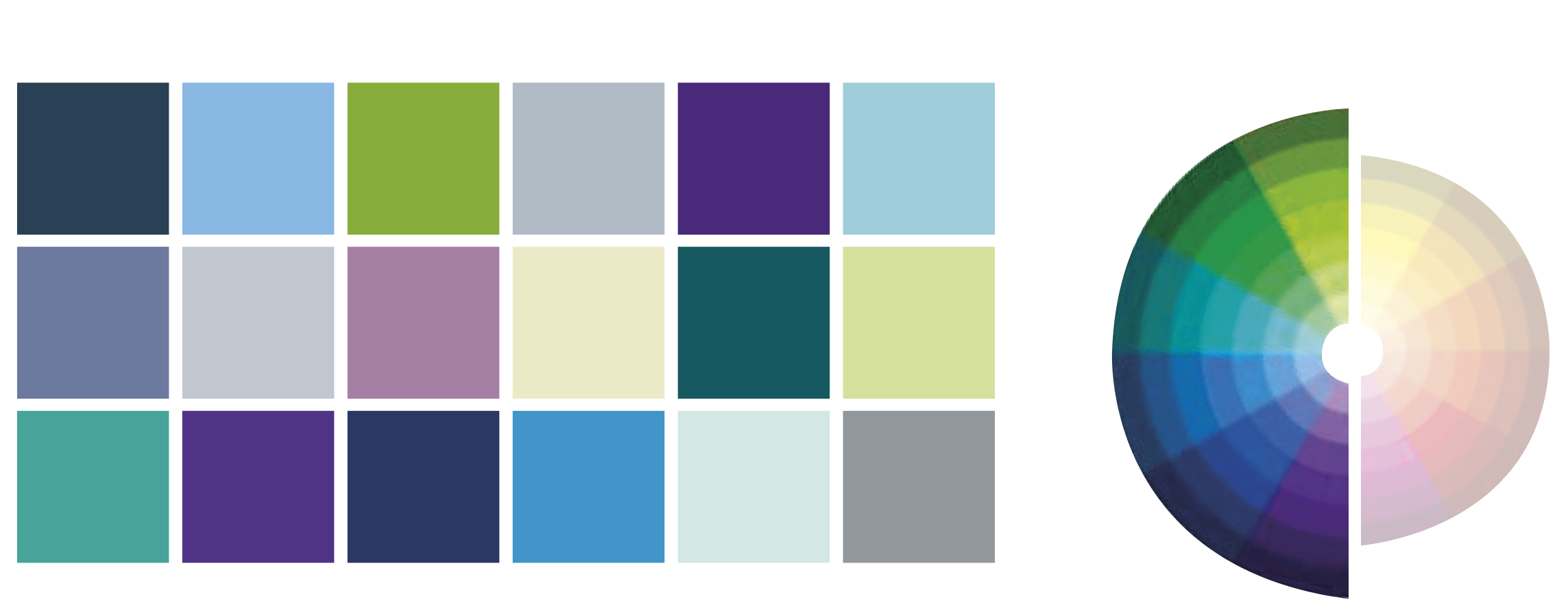
COOL COLOURS
|
Type of colour |
Meaning |
Tips for use |
|
GREEN |
It embodies growth, life and conveys a sense of peace, security and relaxation: its light waves are able to relax the eye. |
It makes a good choice for the bathroom area when combined with furnishing accessories (no wonder it is frequently found in spas and wellness centres, together with blue). |
|
BLUE |
Blue is the most sober and neutral of the cool colours, it evokes calm and favours rest. |
Psychologically blue conveys peace and quiet, which makes it excellent for painting the walls of children’s rooms, preferably combined with warm-coloured furnishings so as to avoid an excessively faded atmosphere in the room. |
|
PURPLE |
Purple is a cool colour in its dark shade but its light violet shade is almost a warm colour. |
In domestic environments is should be used moderately, perhaps for a single wall only, as it can be too overbearing and affected. |
|
GREY |
Being a combination of white and black, grey is a particularly neutral colour. |
It is suitable for both offices and domestic environments, only if combined with a few lively colours. |
NON-COLOURS
|
Type of colour |
Meaning |
Tips for use |
| WITHE |
White is the sum of all colours of the light spectrum, that’s why it is the purest and most neutral colour to be found. |
One of its most significant characteristics with regard to closed environments is that, in reflecting all the colours, it makes any space look brighter. |
|
BLACK |
As opposed to white, black absorbs all the light waves and, for this reason, embodies the total absence of colour. |
It is excellent for refined settings and rooms containing sophisticated decorations. |
Colour analysis in relation to spatial perception
Another analysis linked to colour is the spatial perception that shades are able to confer upon environments. There are several situations we can encounter: let’s analyse the most common ones and how we can resolve them.
• Very tall environment
One solution could be to use a dark colour for the ceiling and to differentiate it from the walls with a lighter colour (the dark colour makes the object seem closer, while the opposite happens with the light colour).
Another solution could be to colour the lower section of the walls (up to roughly 1 m) with a darker colour compared to the upper section.
• Low environment
In the case of a very low room, it can be made to appear taller by painting the ceiling with a lighter colour compared to the other walls.
Not only: the ceiling could also be treated with a glossy enamel finish to give it a mirror-like appearance, which will make the room look taller.
If the environment is a corridor, the side walls could be decorated with vertical strips, alternating a light and dark colour, so as to perceptively “stretch” the walls.
• Enlarging a narrow space
When we have a very narrow environment, we should first of all use light colours, since they make the setting look wider.
An excellent optical trick is to alternate horizontal strips on two opposite side walls, leaving the other two walls lighter and tone-on-tone. This technique is even more effective when used in narrow corridors. In this case, however, we must be careful not to make it look too narrow and long.
• Shallow space
We may sometimes have a shallow room. Colour could be useful in such a situation. The suggestion is to use a very dark colour on a single wall only, preferably bordering the openings with a lighter colour.